Capture One
Introducing the DT Capture One Style Pack
 We are excited to announce the DT Capture One Style Pack which provides a cook book of Capture One looks. They have been developed by the instructor of our Capture One Masters Program based on years of work consulting with a variety of photographers. The range of looks provides something for every genre of photography, whether portrait, fashion, product, landscape or other. Below is a bit of history of how this style pack came to be.
Purchase Now or Download the free demo
For decades my grandmother cooked nothing but combinations of meat, potatoes, and steamed veggies. They were delicious, if a bit repetitive. That was at home. When we’d go out for dinner she’d always pick this little Indian joint and would always order curry. She loved curry. Then one evening as we were driving back from a curry dinner I asked her why she never cooked curry at home. She said, simply, that she didn’t know how. She knew what she liked, but not how to combine the ingredients and tools to get there herself. So that Christmas I gave her an international cookbook, and everything changed. Suddenly her kitchen was full of curries and ceviches. She’d start with the recipes, and then blend elements of Ohio cuisine in unexpected and wonderful ways. Curry Corn on the Cob was a staple of her kitchen for years.
After years of consulting with photographers on implementing Capture One in their workflow I’ve found many are like my grandma. They know how to work the various tools, sliders, and buttons in Capture One to achieve a specific look. But they struggle outside of that comfort zone. They know Capture One is capable of far greater variety. Moreover they may have specific looks they love but struggle to achieve in Capture One. They need a look cook book. The DT Capture One Style Pack is just that.
The looks contained in the DT Capture One Style Pack are as broad as they are carefully crafted. They cover everything from subtle skin tone enhancers to extreme adjustments that are otherwise impossible to manually achieve in Capture One. They are meant to create beauty, solve visual problems, inspire creative experimentation, and reveal powerful tool combinations that many users would never otherwise uncover.
Like any good cookbook they are just the starting point for your own creativity. You can scroll through dozens of looks, find one that suits the image, and then tweak the results in any direction you please. Since (with the exception of the Overdrive styles) they leverage existing Capture One tools the components of each style are yours to see, so using the styles doesn’t just accomplish specific unique looks, it helps train you on what combination of tools are useful to create specific looks.
About the Style Categories

People
A set of nearly two dozen tweaks, twists, and takes on images with skin. Nailing skin tone is a tricky, subjective, and absolutely essential part of any people photography. Some of our solutions are inspired from a deep understanding of film emulsions popular with people photographers such as Portra. Others are entirely new approaches to the issue of skin tone variations. Of course these styles can also be applied to images that aren’t of people. Keep them in mind especially for images which have strong backlighting, or a lot of red. For those looking to isolate skin tone tweaks from all other adjustments (e.g. to apply to an image that has already been stylized, but which needs help on skin tone) we suggest checking out the Skin Tone tweaks in the Tools (see below).
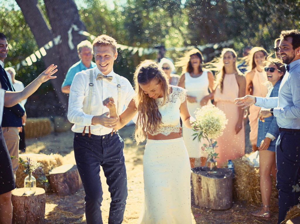
DT Ode – Breeze
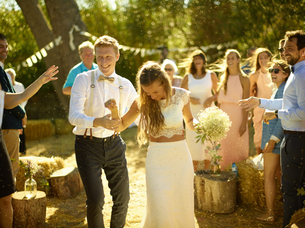
DT Ode – Normal

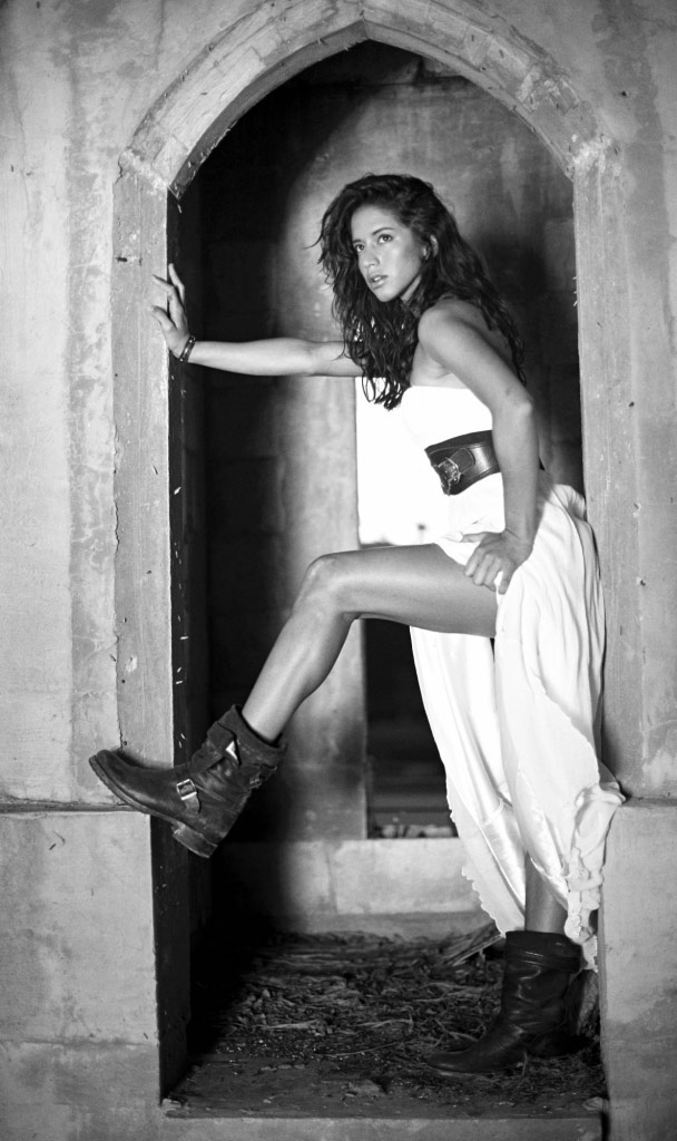
B+W Mono
These are monochromatic styles that produce neutral grayscale images… in other words “black and white”. Some are inspired by my experience with specific films while others are inspired by the black and white work of some of our clients. Most contain several different adjustments in addition to the obvious conversion to black and white. My favorite two are “Bathroom Sink” and “Tidal Wave”. The former riffs off my experiences developing black and white in the dorm sink during college; intense grain, contrasty, and uneven development. The latter leverages the concept of color contrast under the hood to increase local contrast in images that have several dominate colors.
DT BW 8
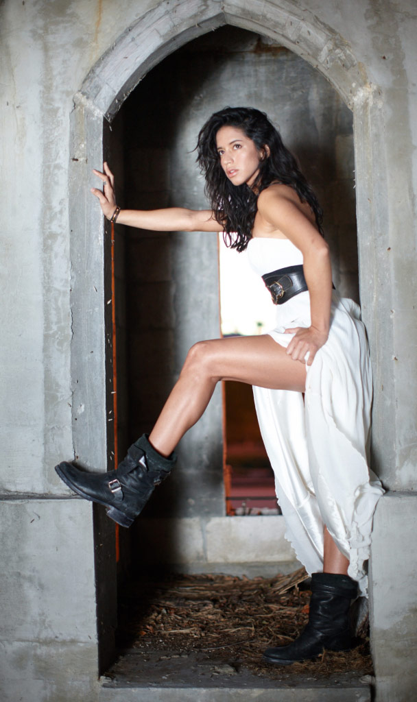
Normal

B+W Toned
These styles leverage the split toning engine of Capture One to provide unique looks. Because split toning can often be a bit much, we’ve provided a subtle, normal, and contrasty version of each. This is one of the easiest set of styles to make your own. After applying the style, open the Split Tones pane of the Black and White tool and play with the hue and intensity of the colors we’ve selected for that style’s duotone; the other adjustments (curves, black and white conversion matrix, sharpening, grain etc) will come along for the ride. My favorite is TinType Alt. It provides a warm tint, but more importantly raises the black point (floor) slightly, with a novel approach to break that floor on certain tones to create a slight posterization in the shadows similar to the glared effect that can pop up in deep blacks on a tintype. It also drops the red tonal response to reproduce the modestly tanned look that tintypes rendered on skin tone.
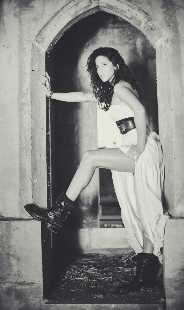
Tintype Alt

Normal

Details
The three variables of sharpening, the four variables in noise reduction, and the film grain tool all effect each other. Playing with various combinations of these tools can be especially difficult because of their technically obscure meanings and the lag many computers will have in rendering their results. My favorite preset in this group is Too Early to Shave which combines a bit of gruffness (low USM threshold and added film grain) with a modest dose of grogginess (lower than normal sharpening, reduced detail enhancement). Those looking for a more clean and commercial look may prefer the Clean Shave style. Because these styles predominantly deal with tools in the Details tab their effect may not be visible when zoomed out on the image. We suggest viewing the image at 100% to ensure you notice the changes being made.
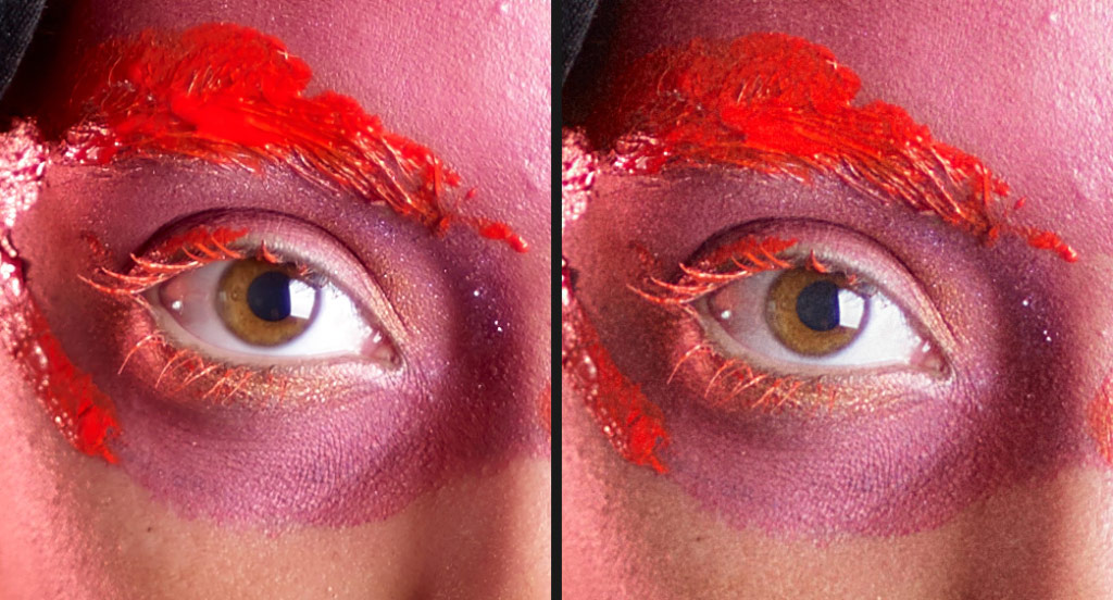

Looks
The broadest and most diverse category in the style pack. These range from classic looks like Georgia Peach which can often evoke feelings of 1970s family photos, to edgy modern stylizations. Because these styles provide the most pronounced look they are the most variable in effectiveness. For any given style in this group there will be images that the style rocks and some images images for which the style is a complete failure. Each style has a light, medium, and heavy version denoted with -1, -2, and -3. My favorite is Peacemaker, which is an understated look with muted tones, deep blacks, and a risky dip in the red shadow response that can bring out magic in some images (which looking horrid in others).
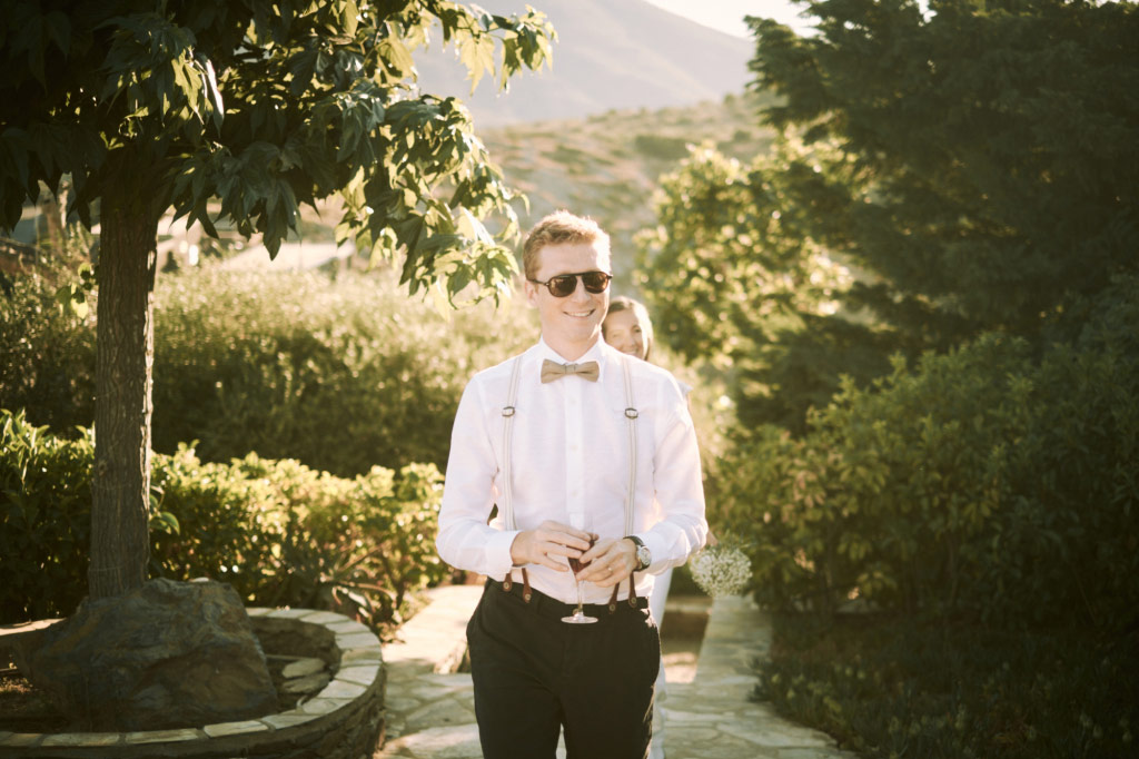
DT Peacemaker – 2
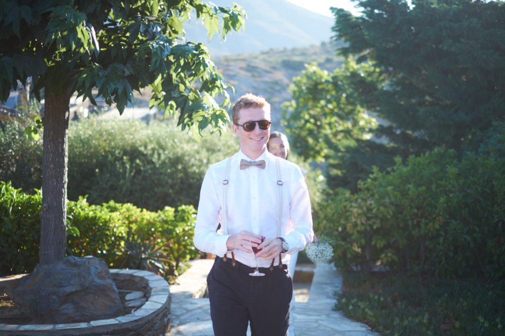
Normal
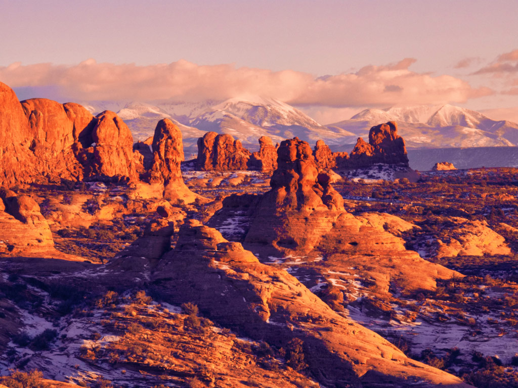
DT Fire and Ice – 3
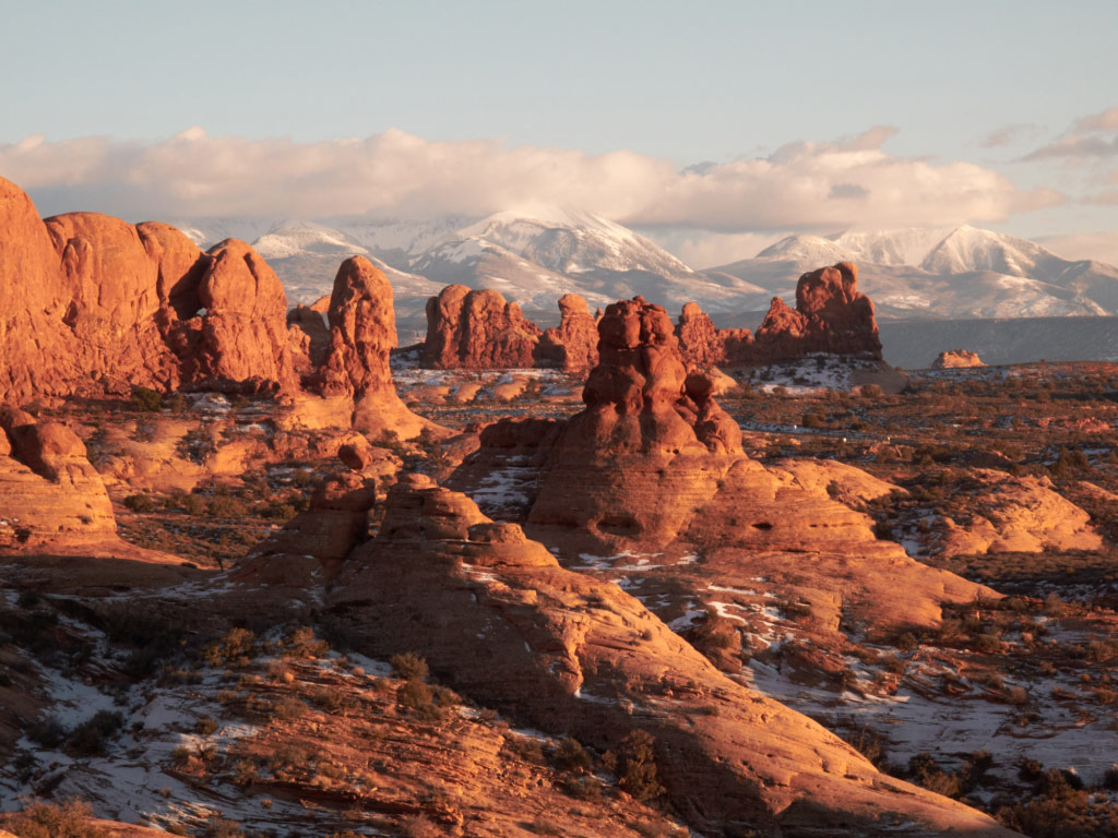
Normal

POV
There are only two styles in this set. The first is inspired by my time in the darkroom. Back when we physically held a negative in our hands and physically loaded it into the negative holder the choice of flipping the image was viscerally present each and every image. In years of consulting with photographers I’ve found it’s very rare for them to play with flipping an image horizontally now that the image is delivered on screen in a virtual way. Sometimes an image is perfectly composed just the way it is, but occasionally an image that just doesn’t “feel right” will suddenly snap into balance when flipped horizontally. Naturally you’ll want to be careful of using this style on images that have text or other elements like auto traffic that will look wrong when flipped. Flipping an image digitally is a one step operation so this style exists not to simplify that process, but to serve as a reminder to consider flipping when you’re experimenting with an image.
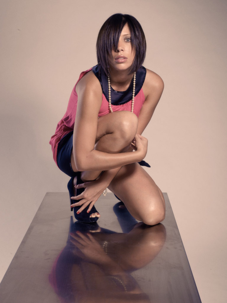
DT LA Office – 2
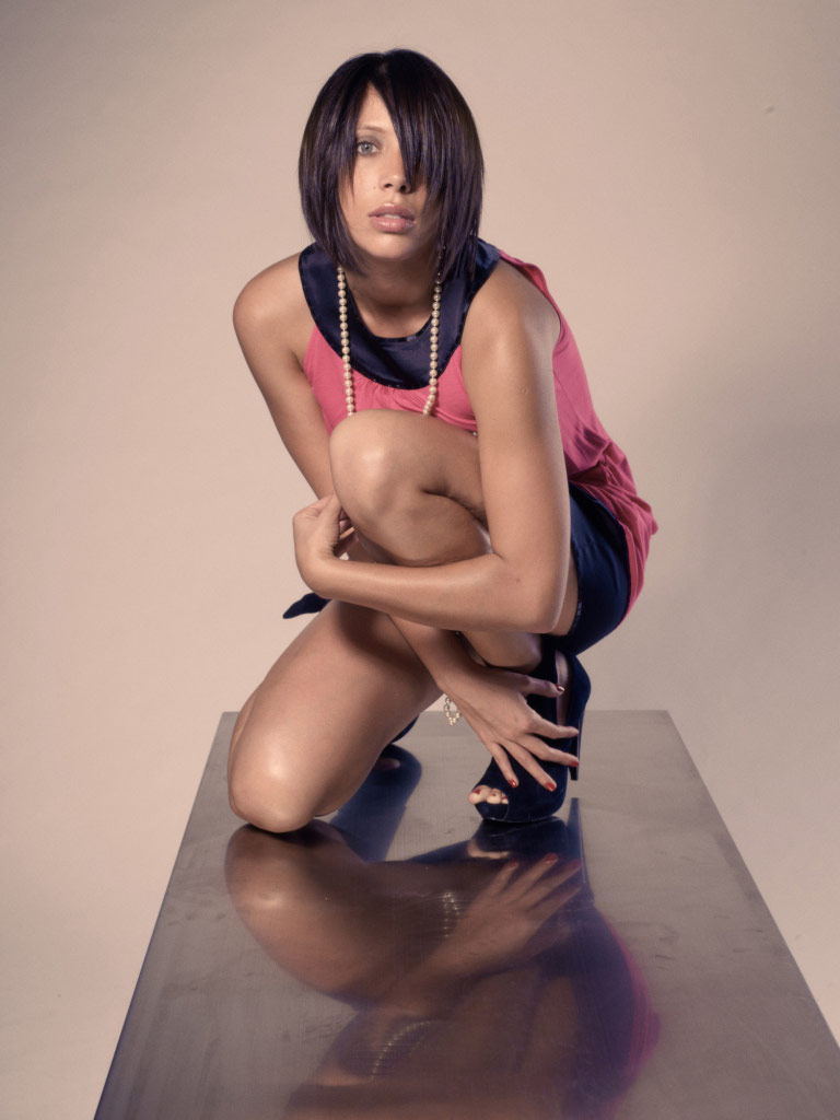
DT LA Office – 2 Flipped

Tools
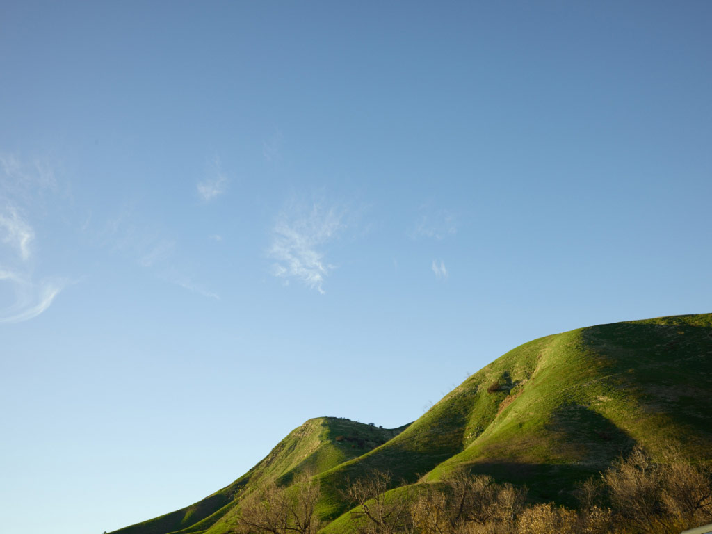
Here we provide a set of solutions to specific problems. There are tone modifiers for sky, foliage, and skin. The skin tone set is especially valuable for deciding what skin tone compliments a particular model in a particular image. Because the tools they use are fairly narrow they can often pair well with other styles. For instance to darken the sky of a landscape image which you’ve already applied the Classico look to.
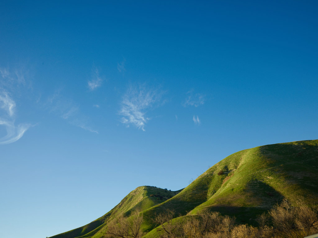
Darken Sky – 3
No Style
Overall Use Suggestions
None of our styles use white balance, as this would limit their use to specific lighting situations. Instead where we warm images we do so with color editor, curves, levels, or color balance. Therefore we suggest you white balance your image to a fairly neutral state before experimenting with our styles. This is not required and you are free to experiment with applying our styles on images that are white balanced to be warm or cool.
I love hot sauce. I love caramel sauce. But they don’t compliment every dish. Similarly while we believe firmly in the quality and utility of every one of these styles it is quite important to note that for any given specific image many of our styles will look strange or out of place. Moreover image aesthetics are subjective; one man’s elegantly understated sepia tone is another photographer’s dog poo. So if you don’t love a style after trying it on several different kinds of images, delete it. Life’s too short, and menus are too full, to keep something you don’t love. You can also consider rearranging the folder structure of the styles to include a folder called “purgatory” where you put styles that you don’t think you like, but which you haven’t resolved to delete yet.
You may love a style, but wish to tone it up or down. In some cases we’ve provided multiple variations of the style for just that reason. But you can also modify a style and the save it back to the same folder. Remember, what we’re providing are C1 styles, not a black box, so you can edit them or save new versions as you please.
Where possible/relevant we have provided guidance on the type of adjustment being made, or the use case it might be suited for. However there are no hard and fast rules in image adjustment and these names are just guide posts. Feel free to use a People Pleaser style on an abstract photo of a red rock, or a Darken Sky tool on a blue dress. In other words: if it feels good, do it.
Some of the styles do strange things when used on images with blown highlights. Be on the look out for strange cross over colors, tinted highlights, and other artifacts when adjusting high key images. This is not an un-missed error; it is a natural limitation of some of the risks we have taken to achieve unique and powerful looks.
Some of the styles make drastic adjustments to the tone and color of the image. How well a given image holds up to this depends on the technical merits of the file (as well as the aesthetics and subject matter). For instance a dSLR file will not handle strong adjustment as nicely as a Phase One medium format digital raw file. So if you’re adjusting the image from, for instance, a Canon 5Ds and select a style which pushes the shadows three stops the result may not be very robust in the shadows (e.g. you may get noise, or banding, or strange/poor/warbling color in the shadows).
The DT Overdrive Disclaimer
Included for free with your purchase is the DT Overdrive Style Pack. This pack is very different than the others. It contains hacked adjustments that are not otherwise possible in Capture One. Because it is a hack it is absolutely, positively, NOT guaranteed to work and may even cause significant issues. Install and use them at your own risk, and only use them on copies of valuable files. Capture One was not designed to work in the way that DT Overdrive styles forces it to; they purposely blow past limits and safety stops in the software to provide unique and otherwise impossible-to-achieve looks. They are included, as much as anything, as a curiosity to nerds who like to push limits and see where things break. If you are a more casual user, like to play it safe, or don’t want to deal with the potential (likely?) ramifications of purposely mis-using software please do not install or use them.
Compatibility
These styles were developed with Capture One 9.1 and latter in mind. If you are using previous versions of Capture One these styles may not work, and we do not suggest trying. If you do not own Capture One please consider purchasing it from our store (Buy Capture One). Also, since the styles use many adjustments which were introduced in version 9.0 or 9.1 they may not work on images that are still using earlier Engines. To see what engine an image is using please go to Base Characteristics. If you see anything other than “Capture One 9” next to engine we would suggest upgrading the engine of that image before applying any of our styles.
DT Capture One Style Pack works with both Mac and PC versions of Capture One.
Installation and Use
Please make sure Capture One is installed and working on your computer before purchasing our styles pack. Capture One is NOT included in your purchase; you must separately own and install it.
- Do NOT use the Import Style command within Capture One or all 130+ styles will be dropped into a single folder, which will lose the nice folder organization we have provided. Instead…
- Purchase from our online store (link)
- Download the zip file of our styles (link is provided at time of purchase)
- Unzip
The next step depends on your operating system:
- Mac: Drag the folders into your user library (need help finding your user library? read this: https://helpx.adobe.com/x-
productkb/global/access- hidden-user-library-files.html ). - Windows: Drag the folders into \Users\username\AppData\Local\
CaptureOne\Styles[version number]
Please keep your own backup of the original DT Capture One Styles Pack zip file.
If you have difficulty please contact support@digitaltransitions.com with as much detail about the problem you’re having as possible.
For basic use see these two YouTube videos. These videos show styles in Capture One v8, but the styles tool itself is unchanged in version 9.

